Are you sure you want to perform this action?
Aksiom
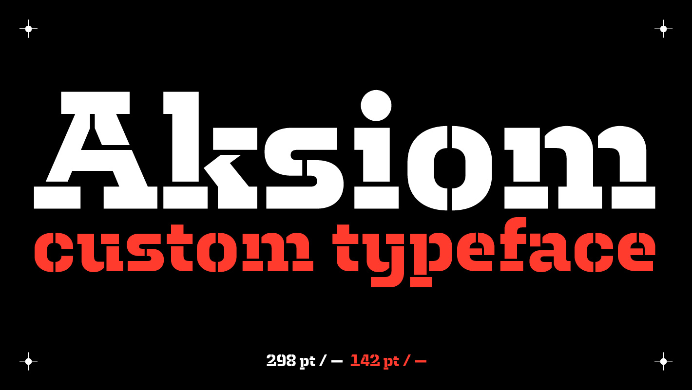
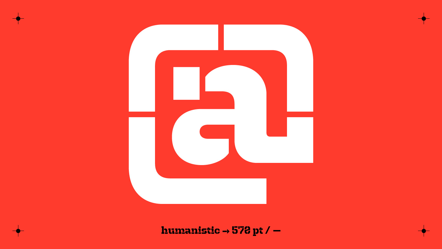
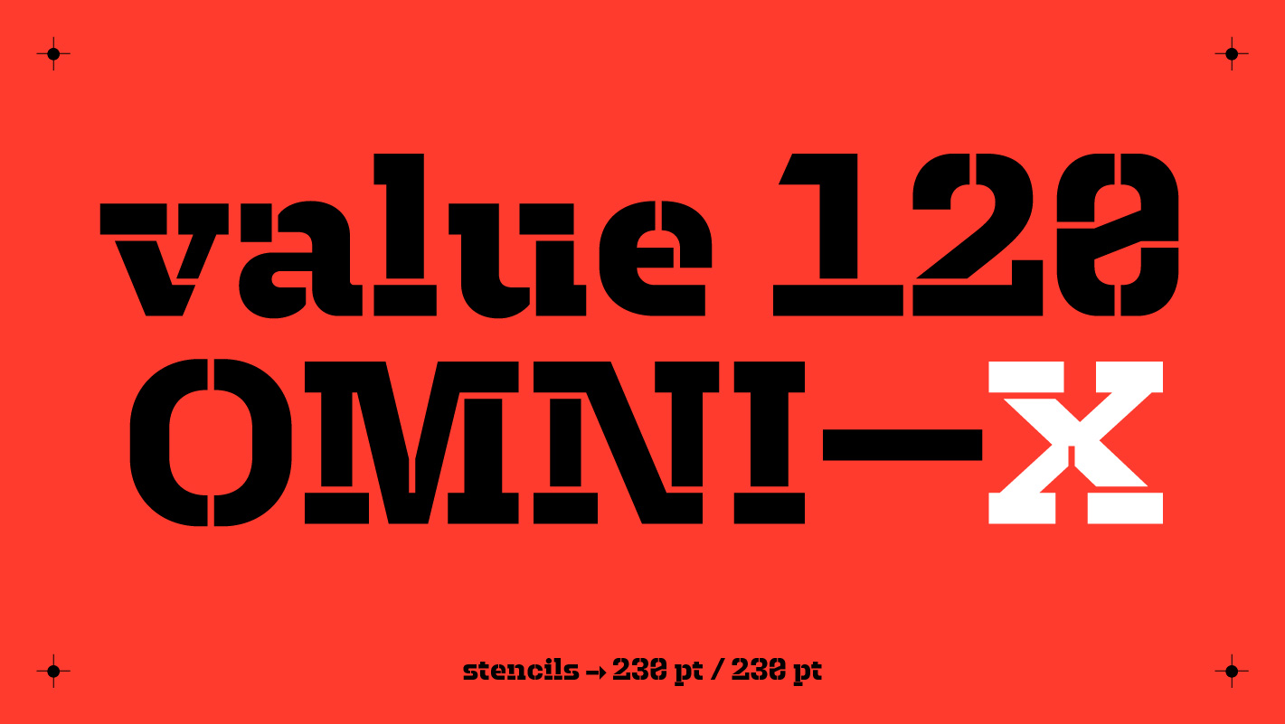
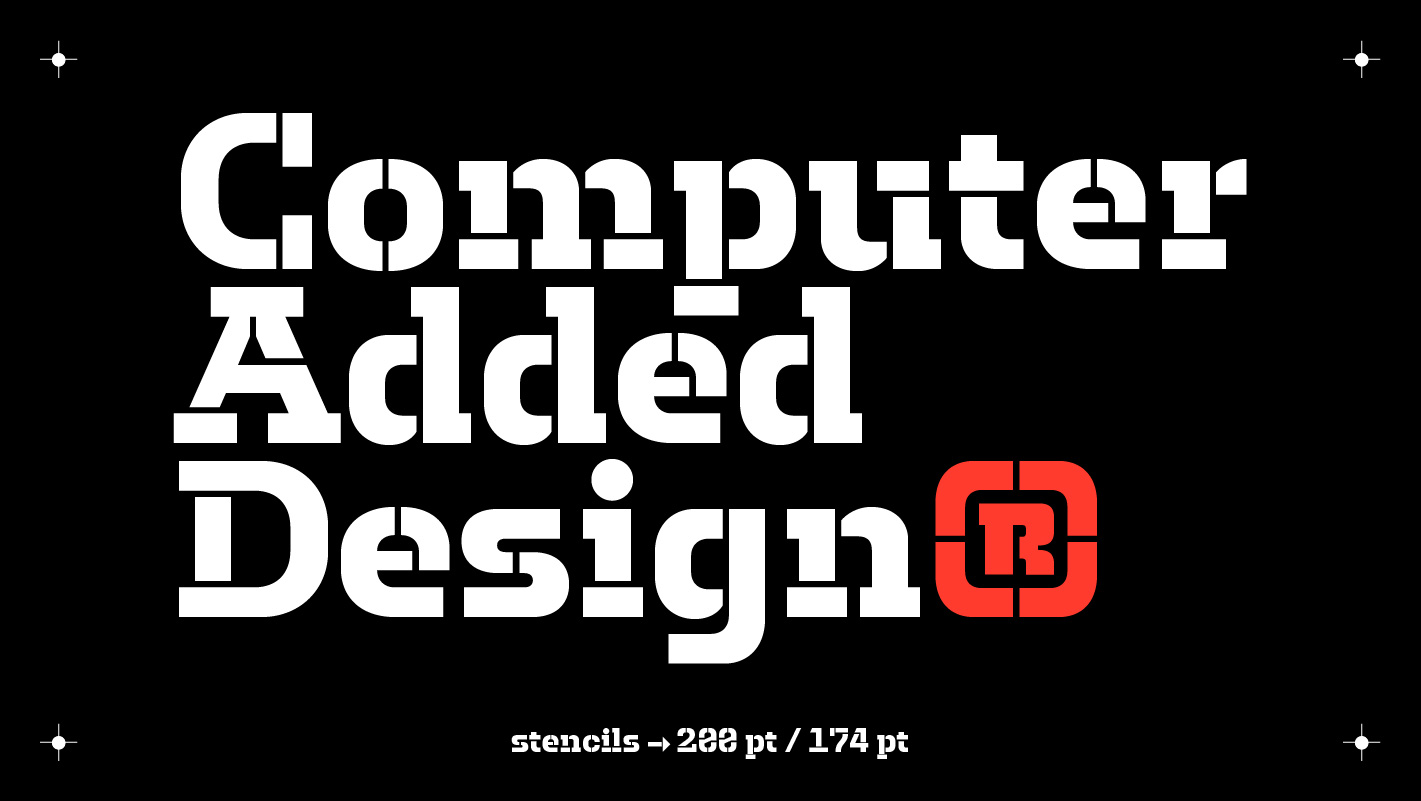
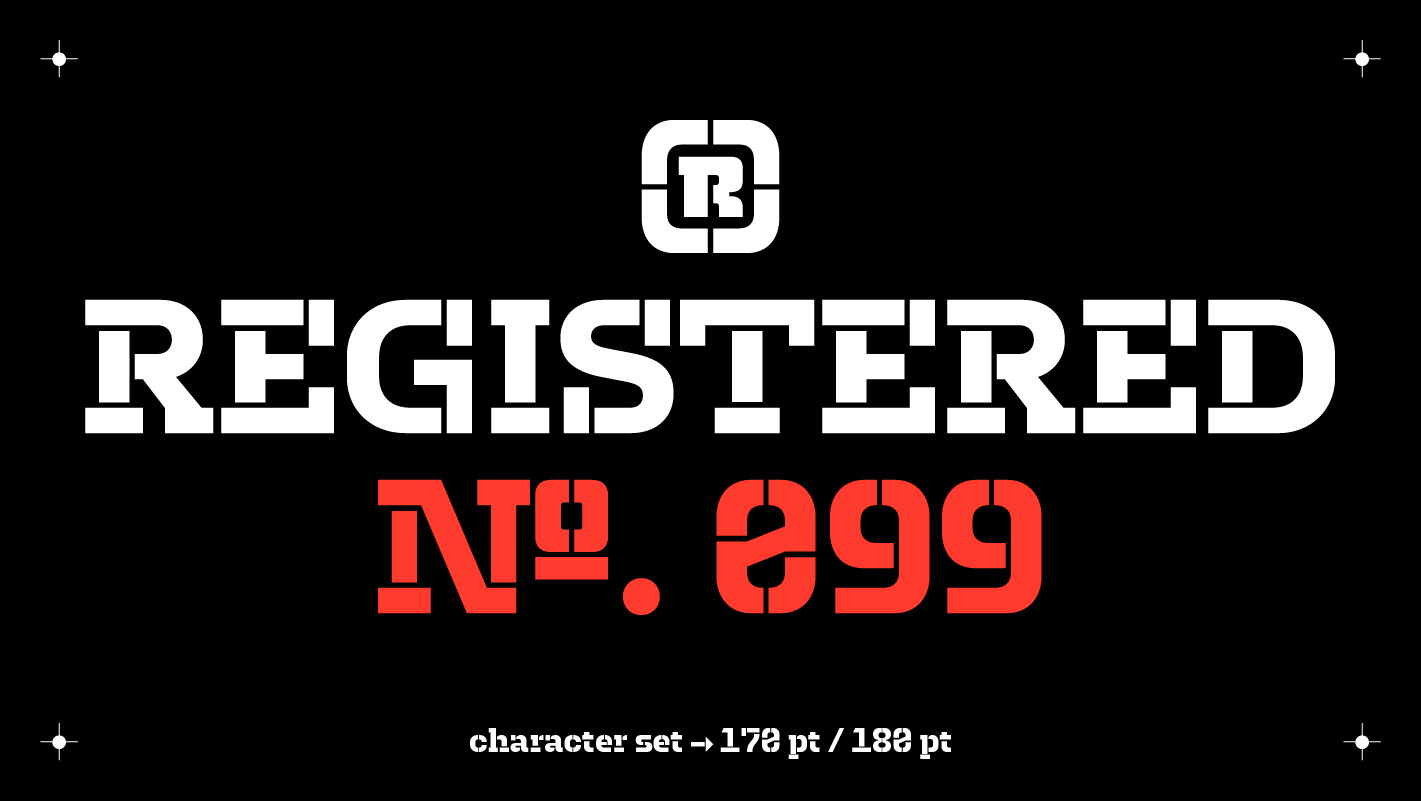
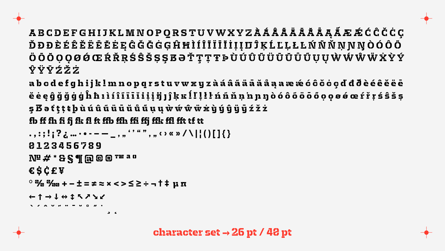
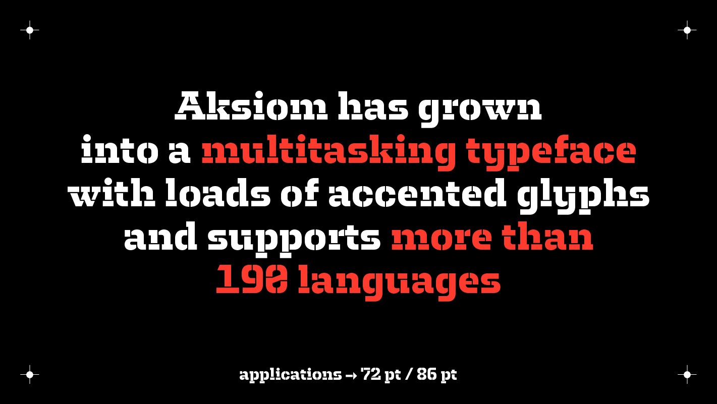
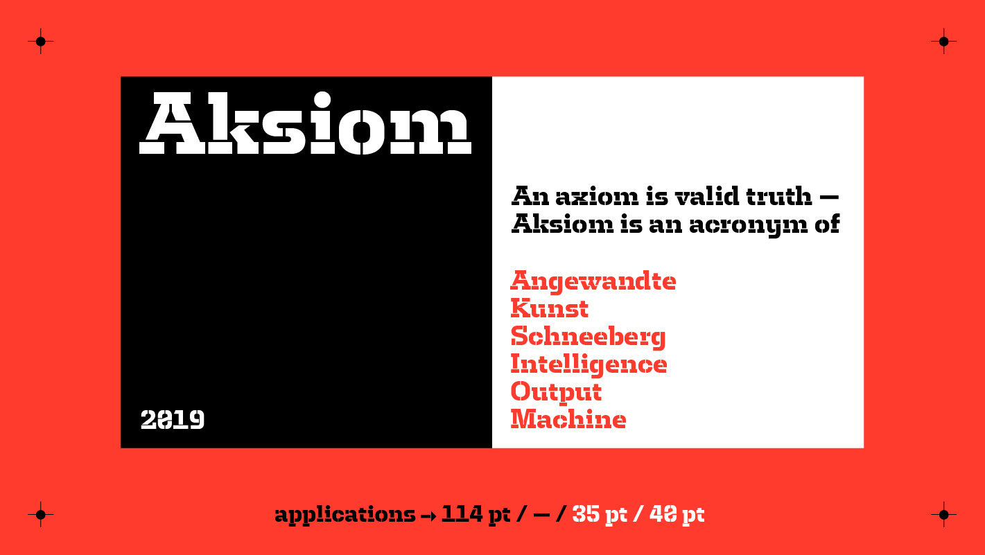
The stencil typeface Aksiom is a custom development for the Faculty of Applied Arts Schneeberg (Angewandte Kunst Schneeberg), which is part of the University of Applied Sciences Zwickau. As an acronym of »Angewandte Kunst Schneeberg Output Machine« the name also derived from the mathematical term »axiom«, which describes a fundamtally valid truth without any proof needed. Therfore the name already transports the unrestricted validity of the works, which arise at the faculty. Aksiom was created as a visual base tool, a new and fresh medium for the faculty to express itself. The concept idea was to create a fluid visual identiy, which makes a static logo or conventional corporate design obsolet.
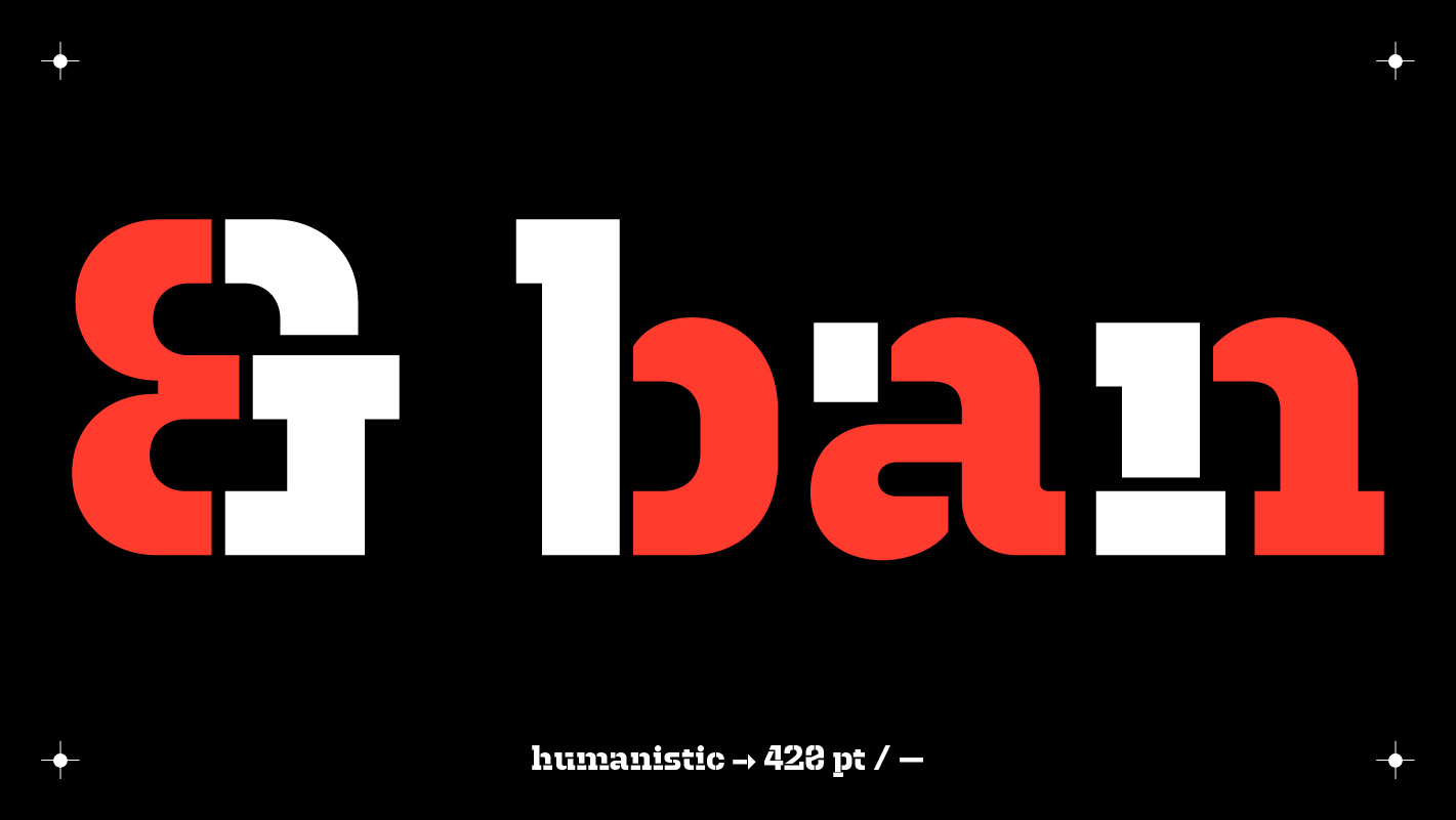
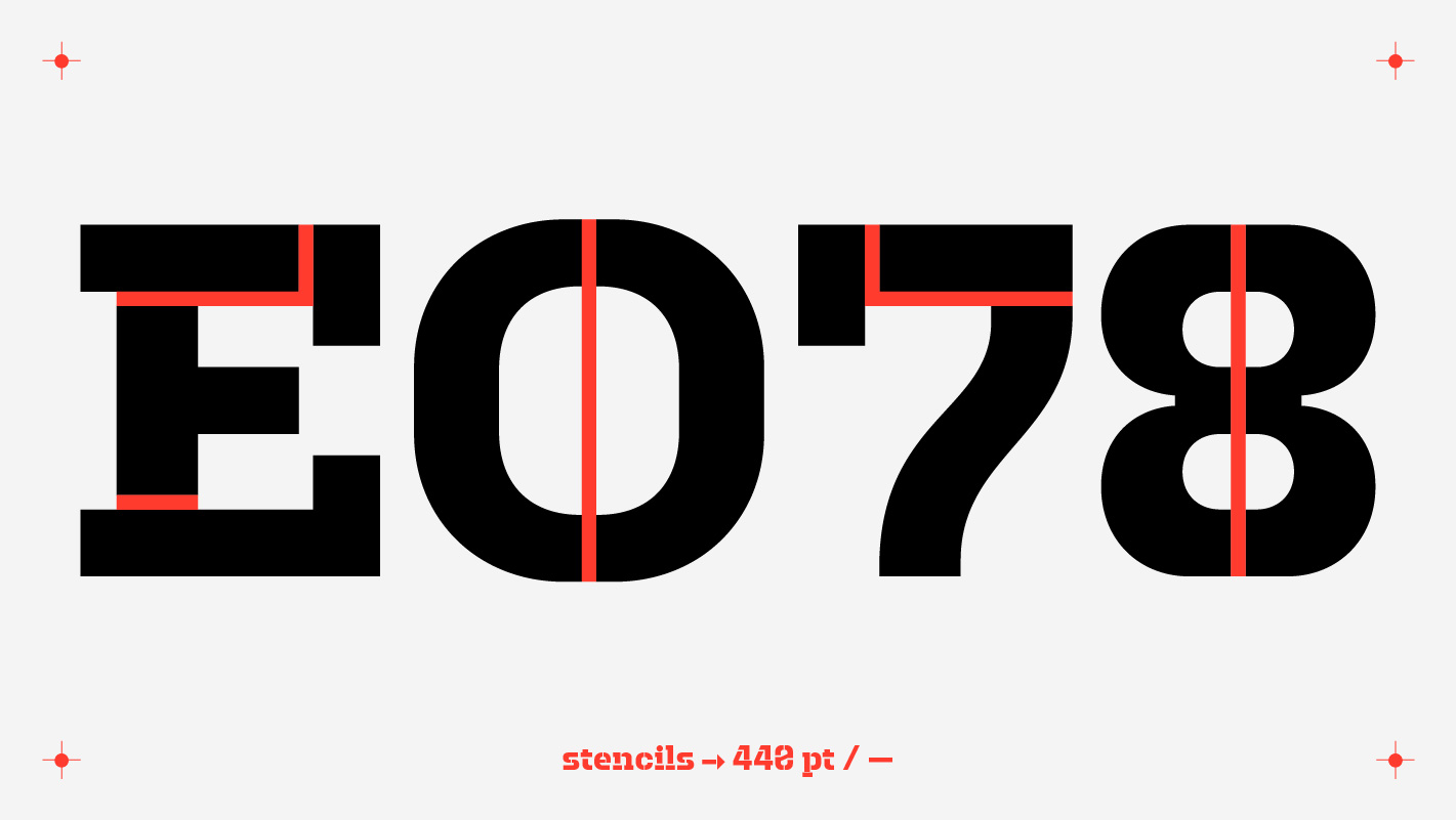
With every single usage of the letters, the identity of the faculty is growing, and the formal character of the typeface asks for an active and open-minded participation. Hirstorically stencil lettering was a precise method in the field of typography (by definition »writing with prefabricated letter forms«) besides the printing establishment, a democratized way to label a variety of surfaces with sharp and identical letters.
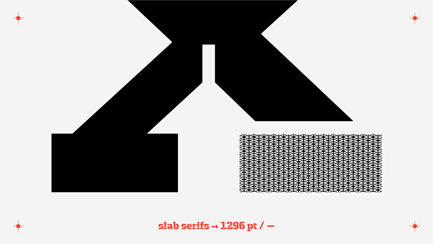
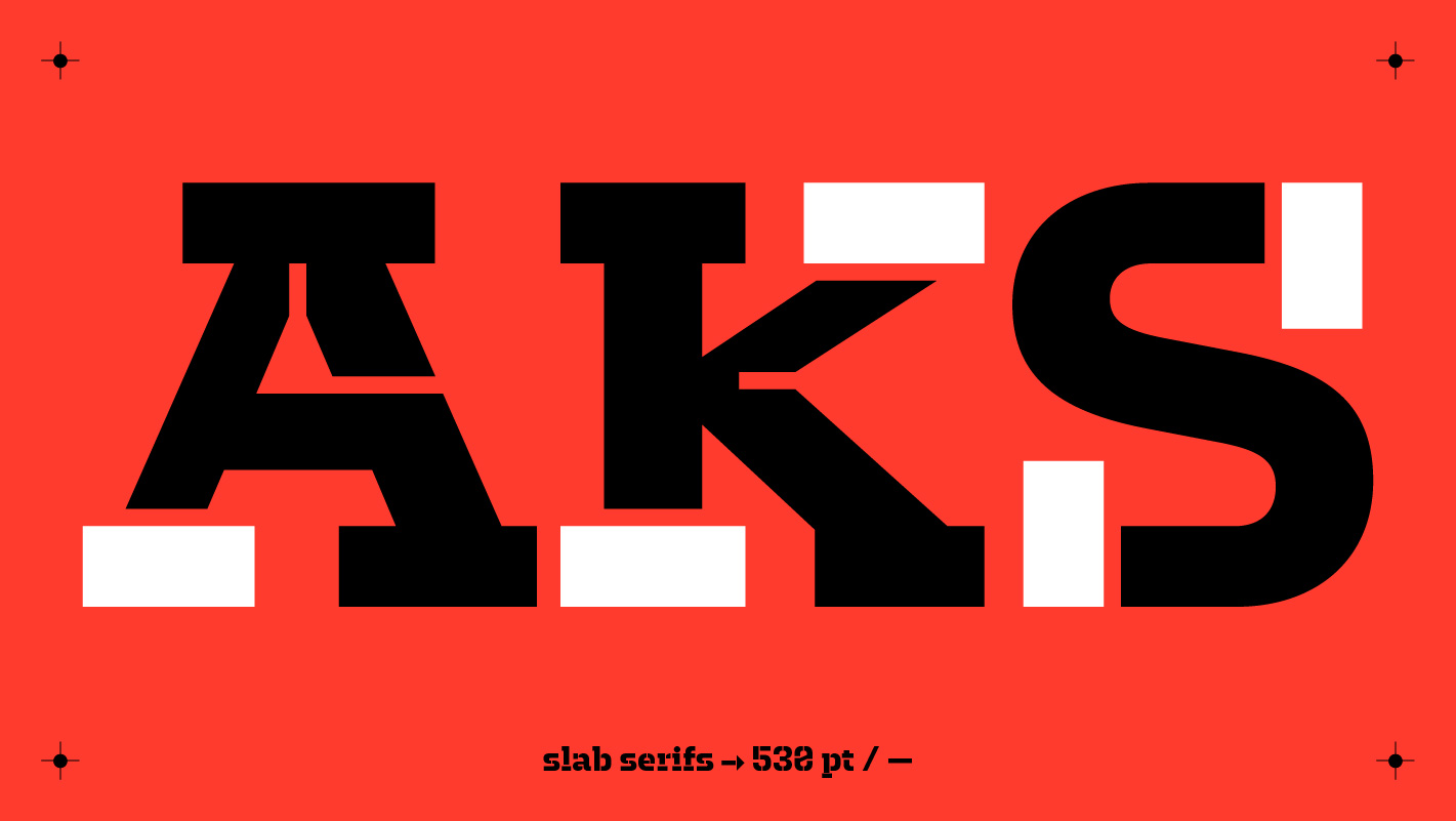
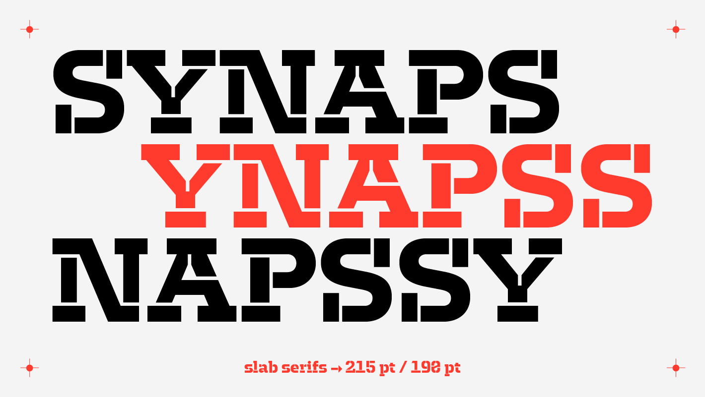
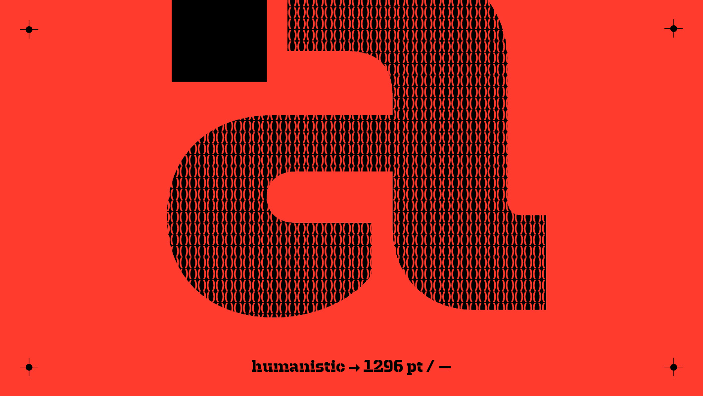
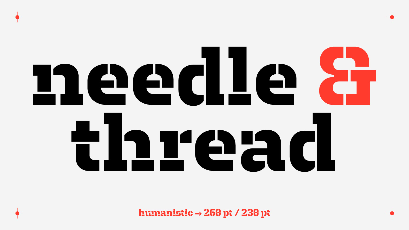
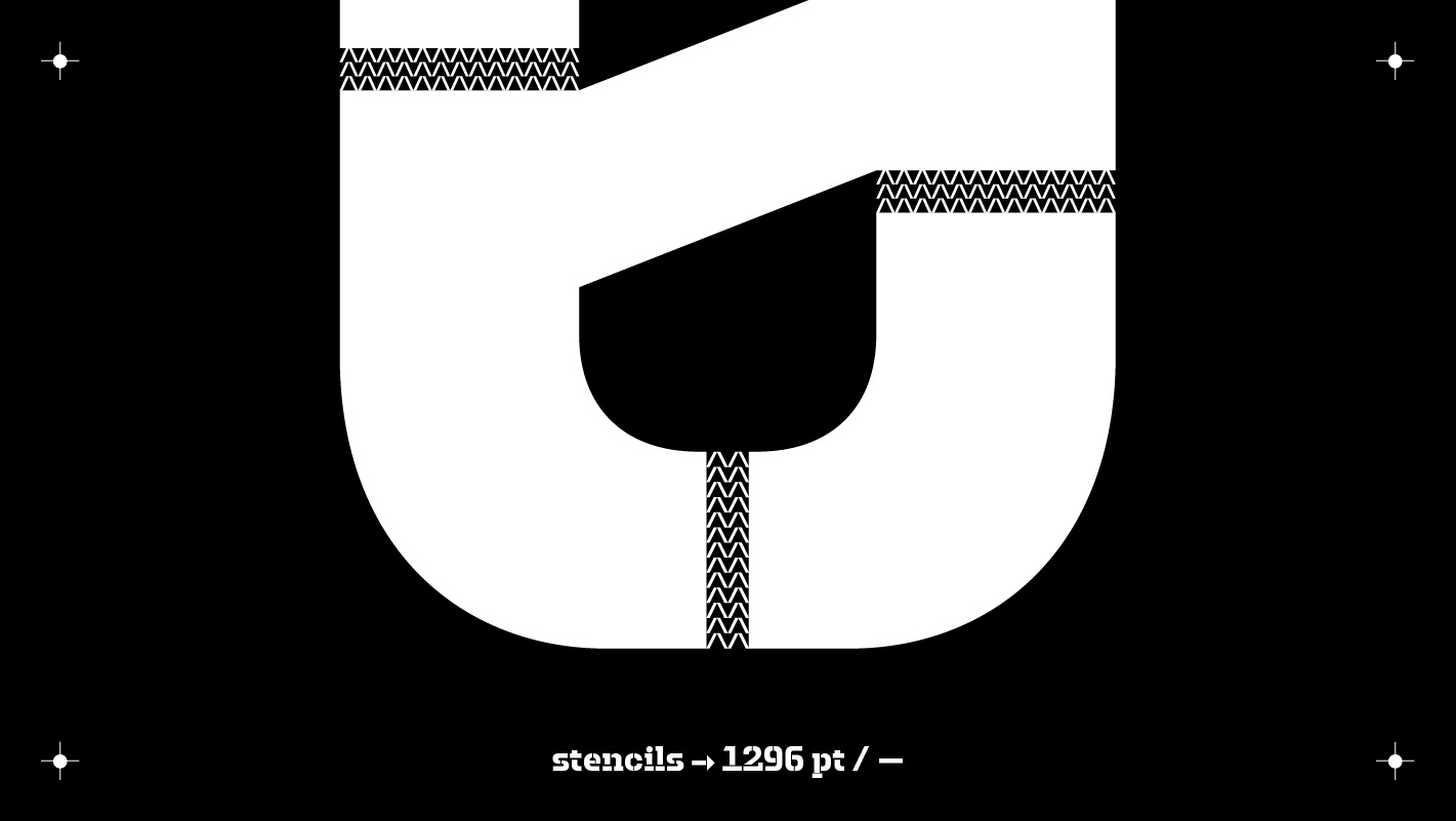
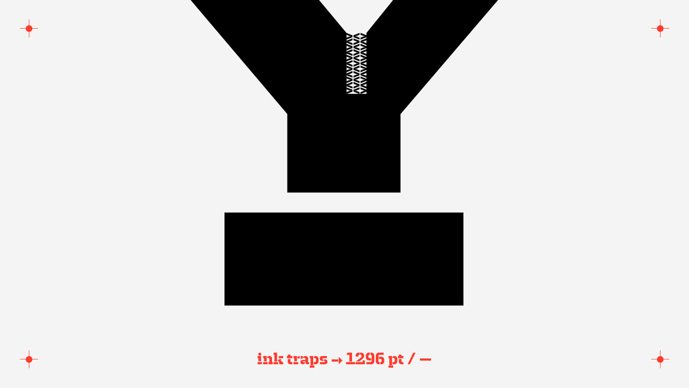
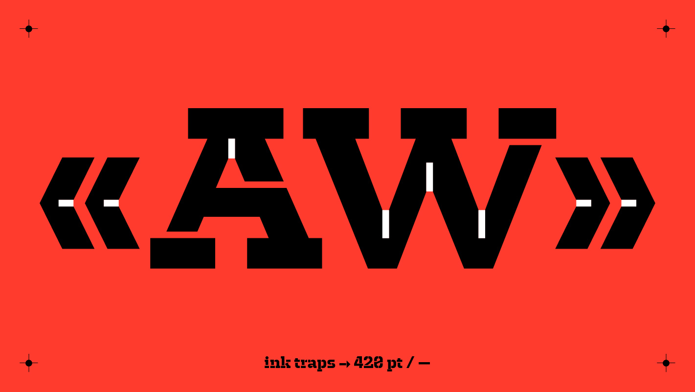
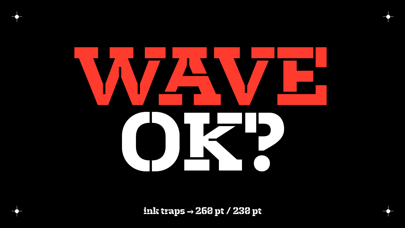
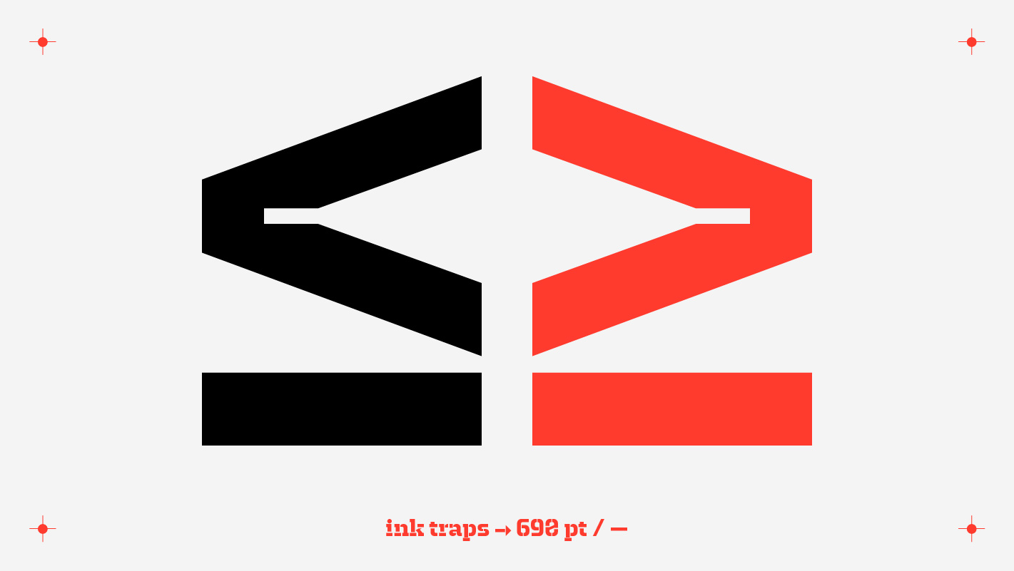
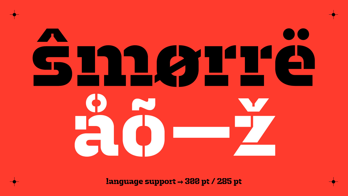
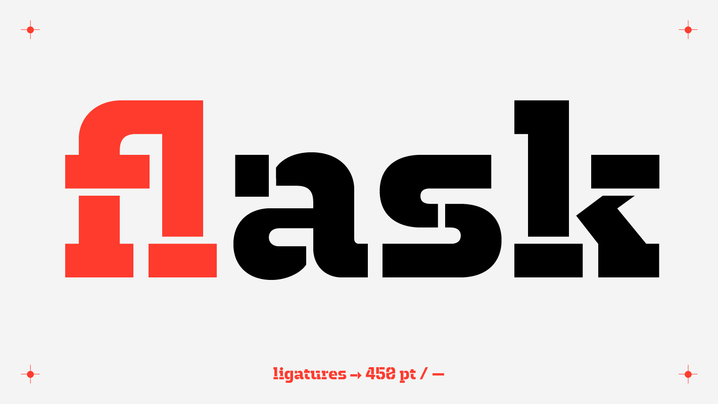
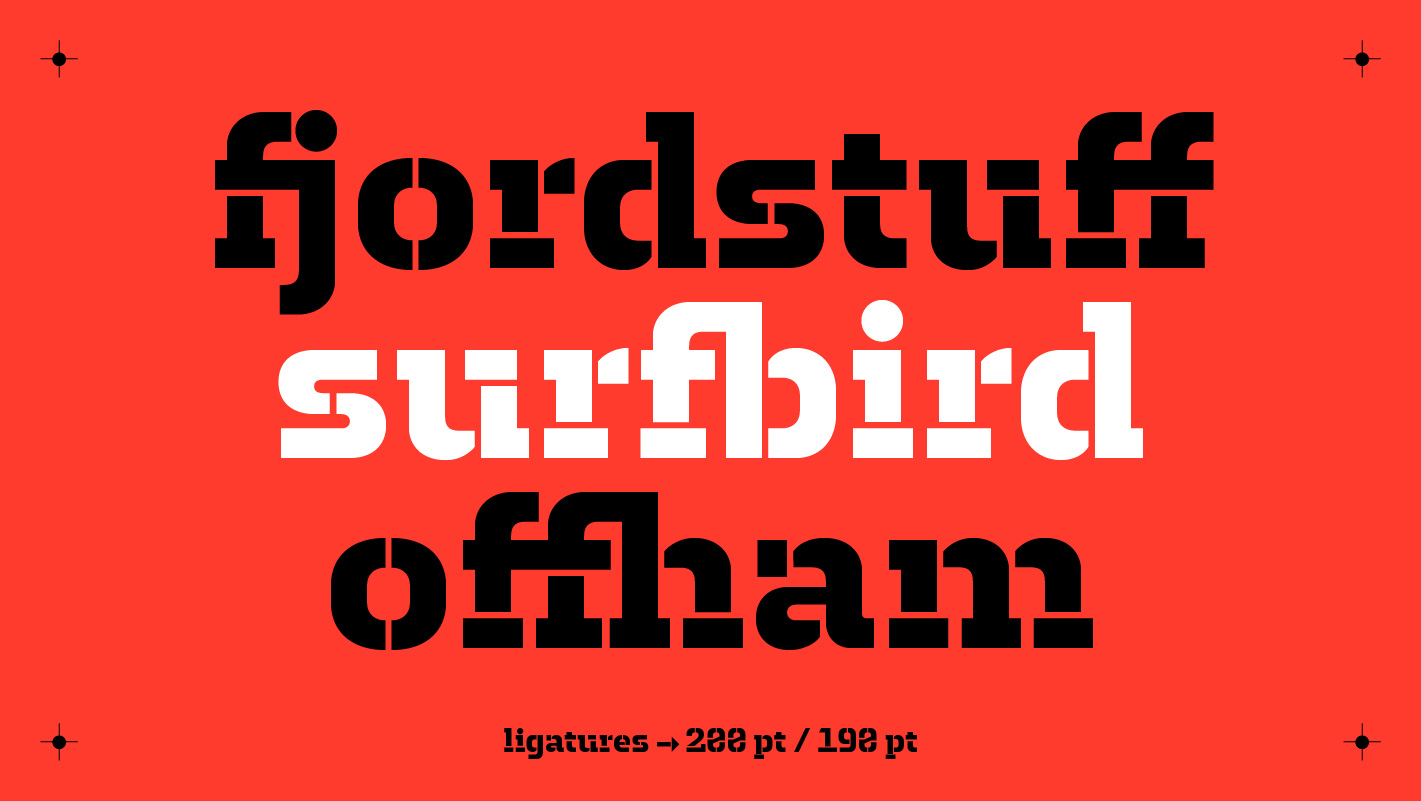
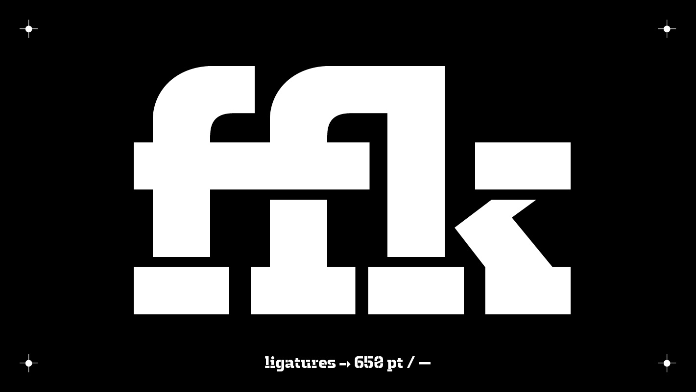
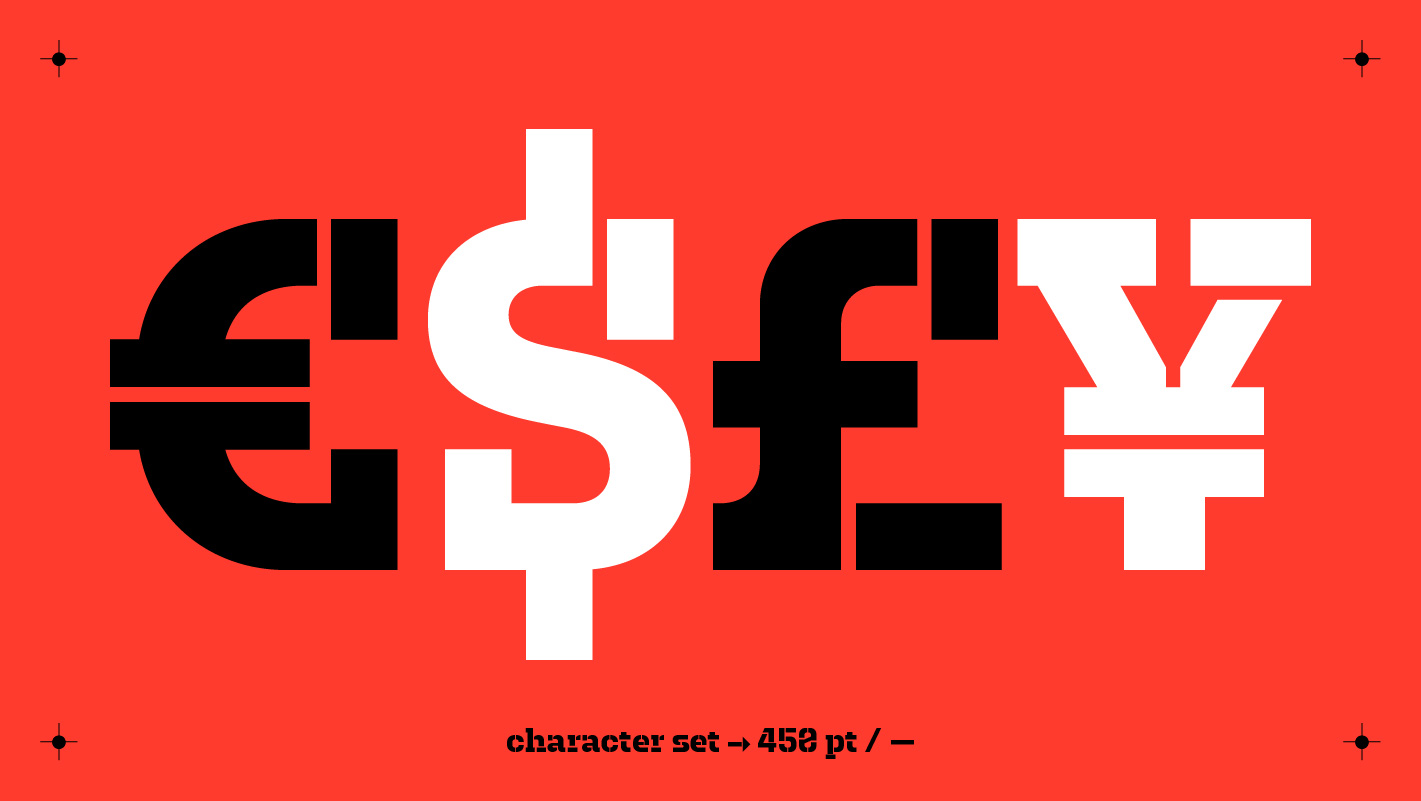
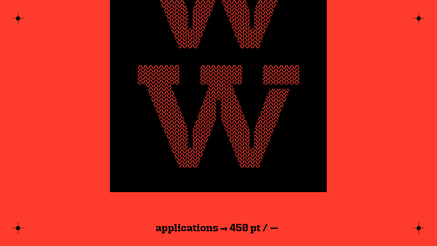
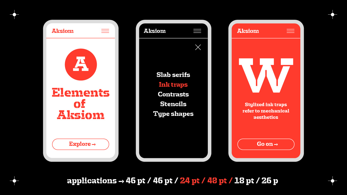
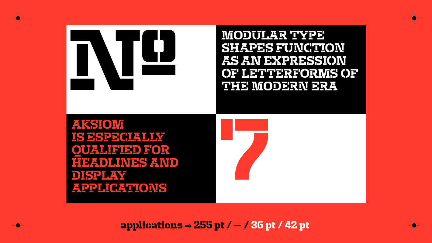
Aksiom combines various aesthetic principles. Slab serifs refer to the typographic viusality of the industrial age and give the typeface a catchy and elemental character. The distinctive shape of the ink traps, which were historically used to avoid round corners in the printing process, become independent stylistic elements that refer to the mechanics. The modular shapes are combined with a classic humanist construction.
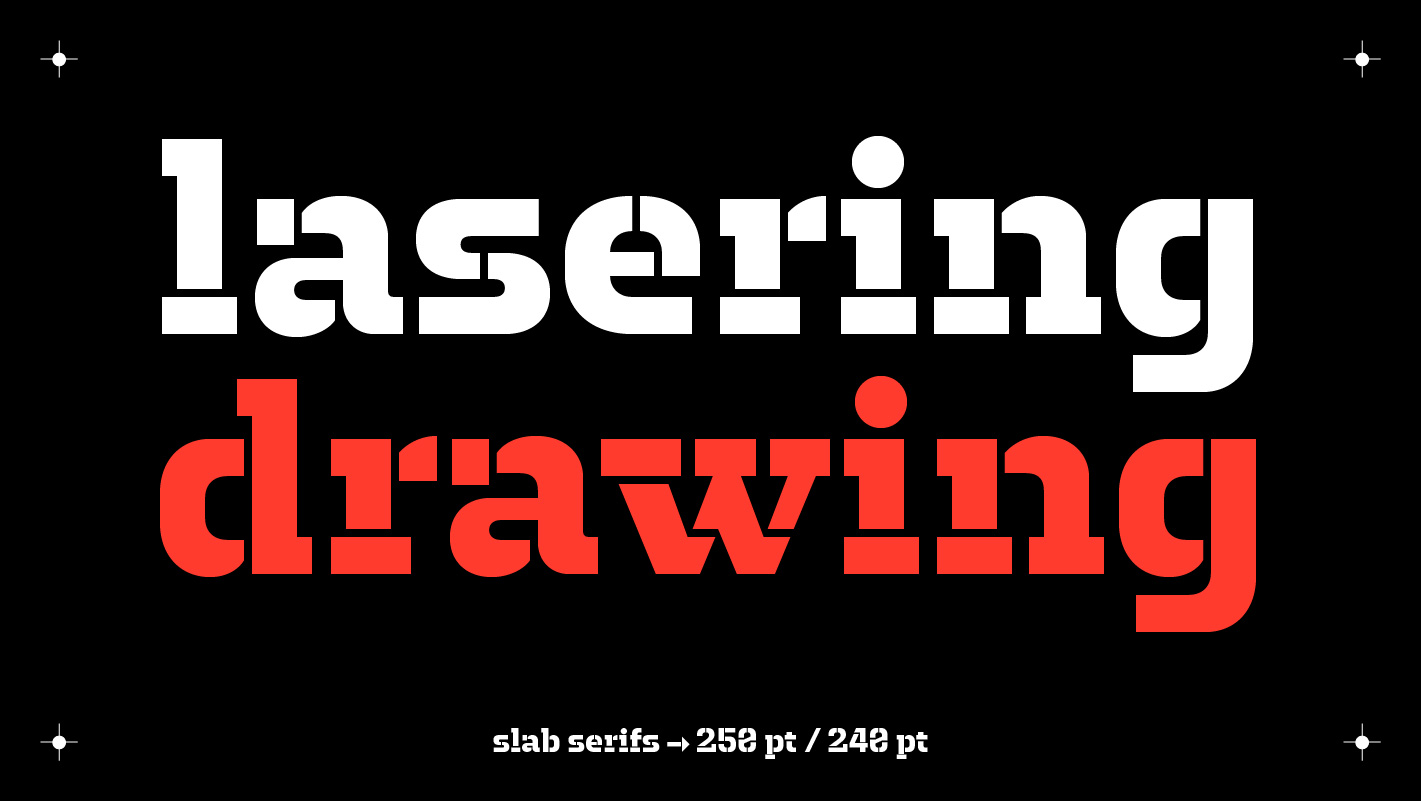
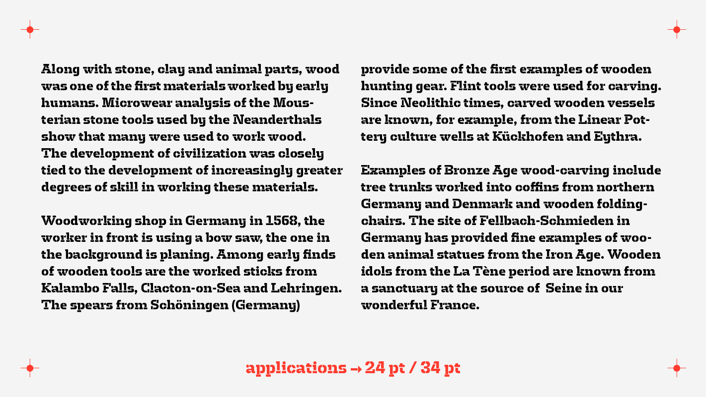
Aksiom can not only be used for desktop publishing, but also on fabric, wood, walls, or as laser cutted forms.
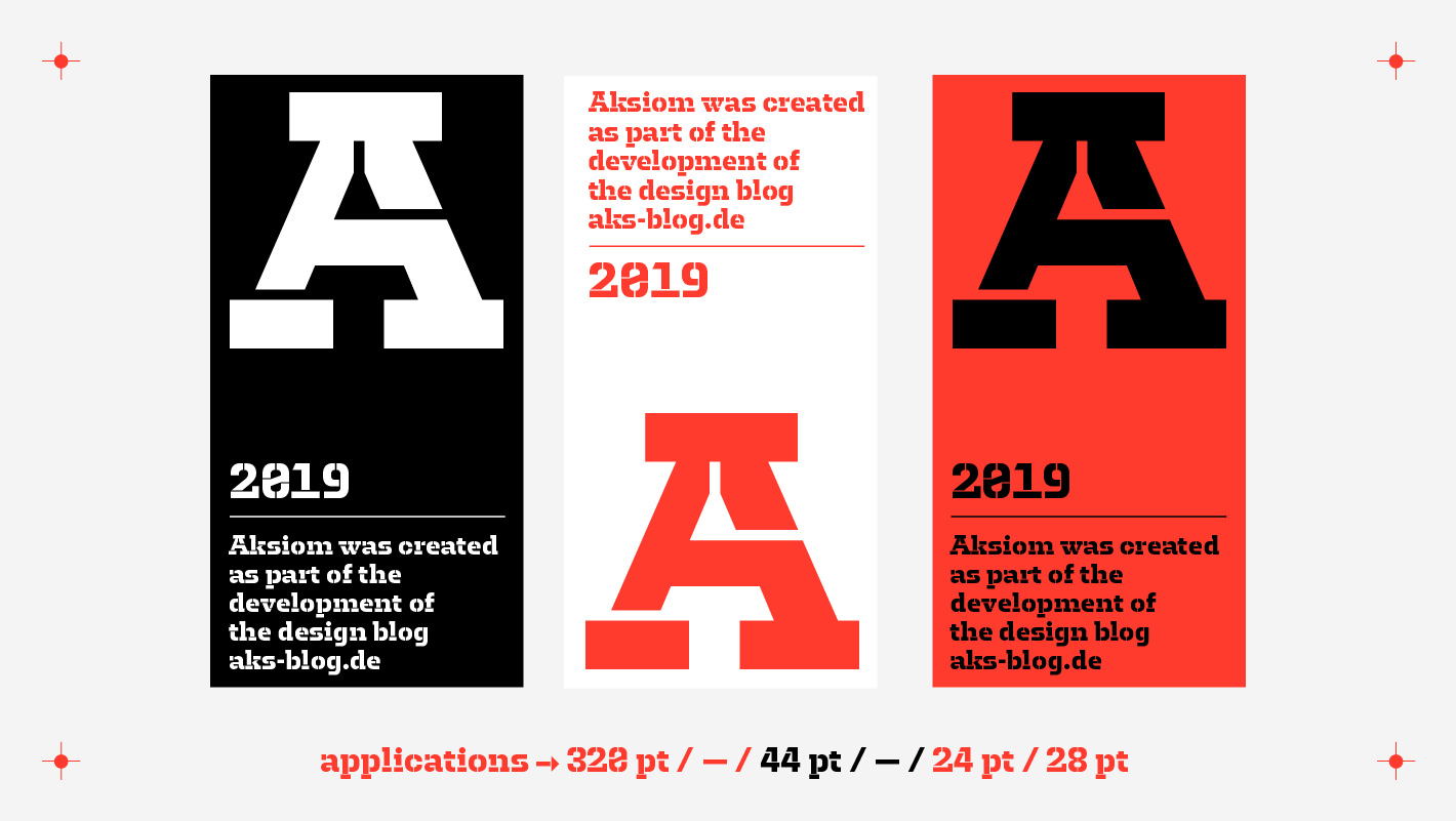
Aksiom in use: aks-blog.de
