Are you sure you want to perform this action?
18. September 2020 • Match Story
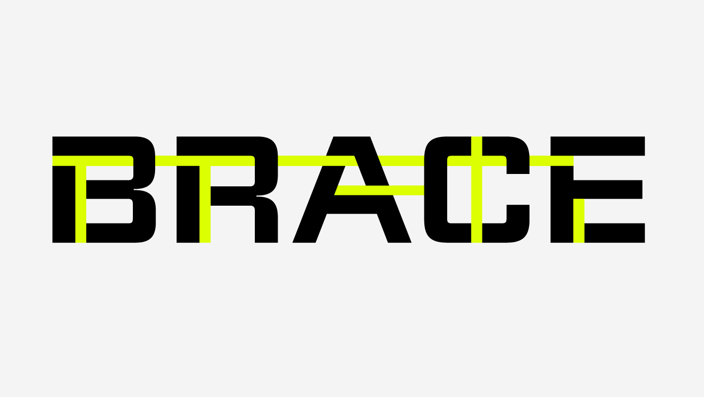
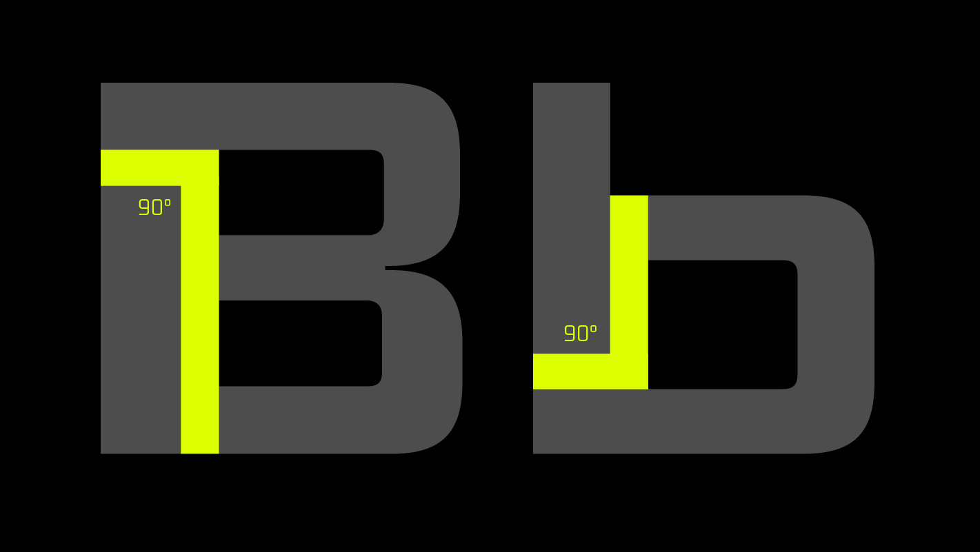
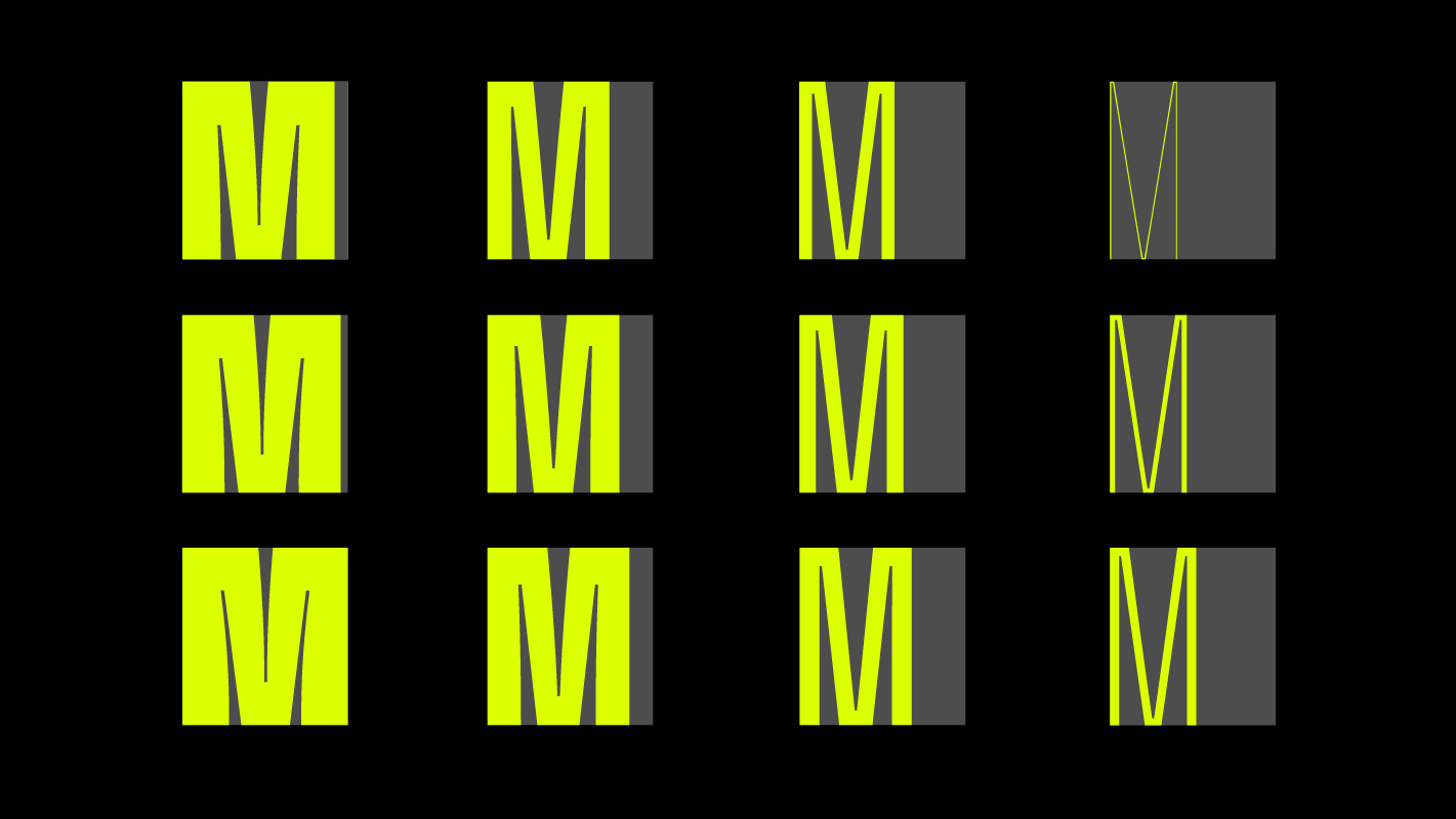
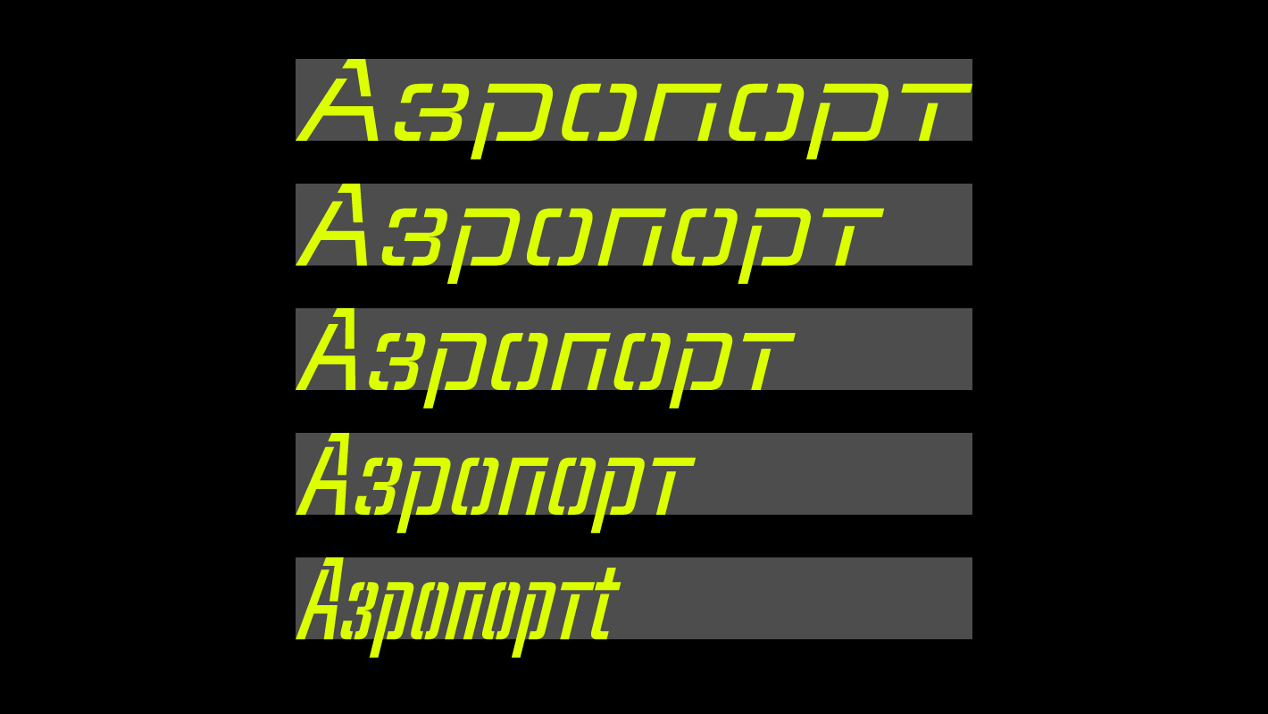
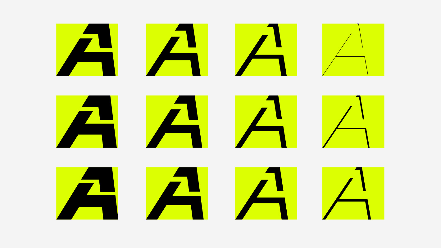
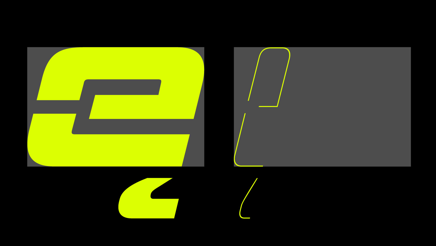
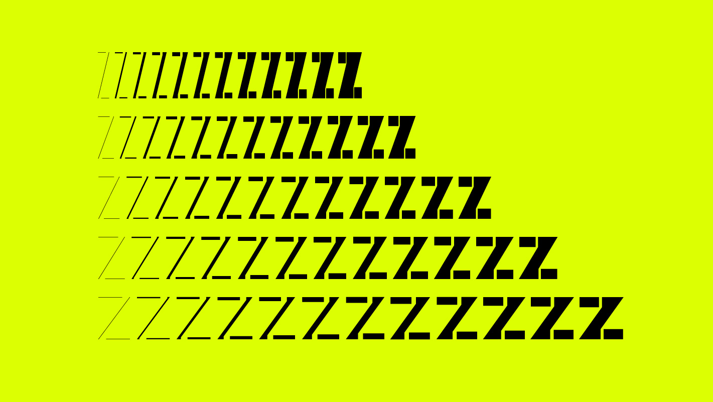
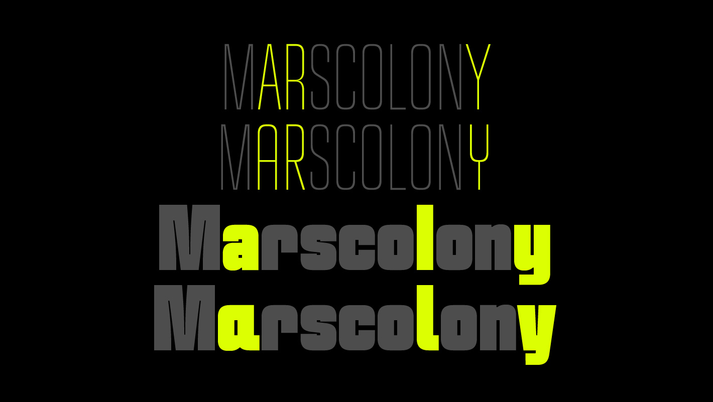
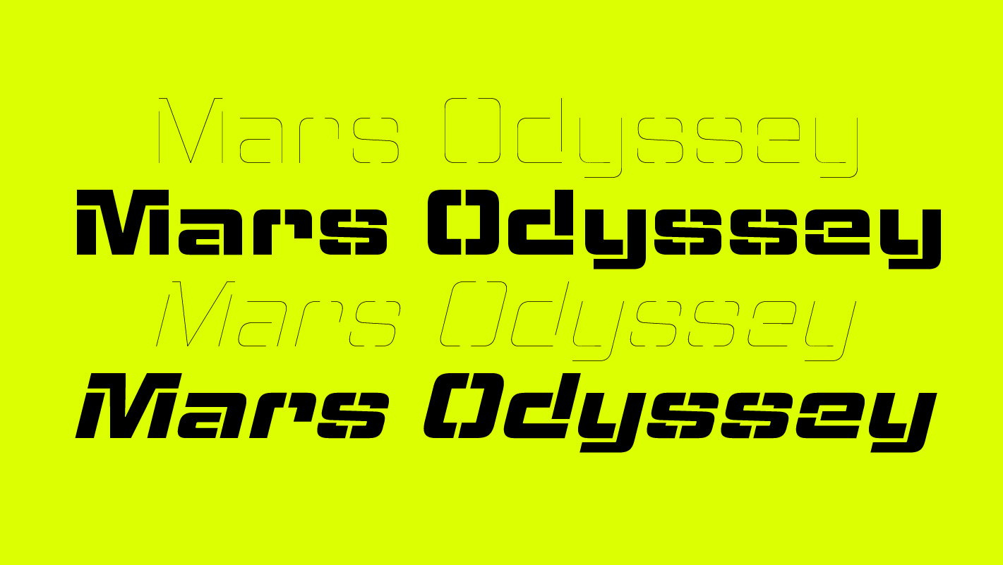
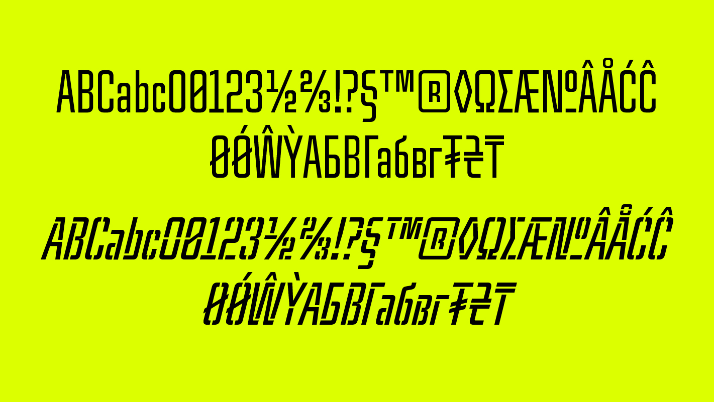
What does a typeface look like that can be used to label a spaceship and that is related to science fiction without looking cartoonish? These questions shaped the conceptual basis for the development of TR MatchStencil, which began in 2013 as an entertaining exercise in a simple stencil font and has grown into a super family over time. TR MatchStencil follows a clear design principle with right-angled stencil bars and the consistent avoidance of diagonal bars, as known from many other stencil fonts. Simplicity and the avoidance of functionless details formed the core from the very beginning. With the completion of the first width of TR MatchStencil, the idea of designing a closed version of TR MatchStencil based on its shapes accompanied us more and more. The first goal was to create a straight headline font with the same proportions as the stencil version. However, as the design progressed, our ambition to expand the family for mass text applications grew. Since the closed version should have exactly the same width as the TR MatchStencil, the idea of simply closing the stencil bars was obvious. But the result was sobering: the closed stencil bars made the characters look stiff and were not suitable for typesetting longer texts. As a result, the formerly right-angled transitions of the lowercase letters developed into classic intakes, the formal language became much more moderate and rounded without the need for changes in spacing. The changes of the closed version again created a feedback to the stencil version — we revised the proportions towards more classical shapes and also focused on the usability for wider text applications.
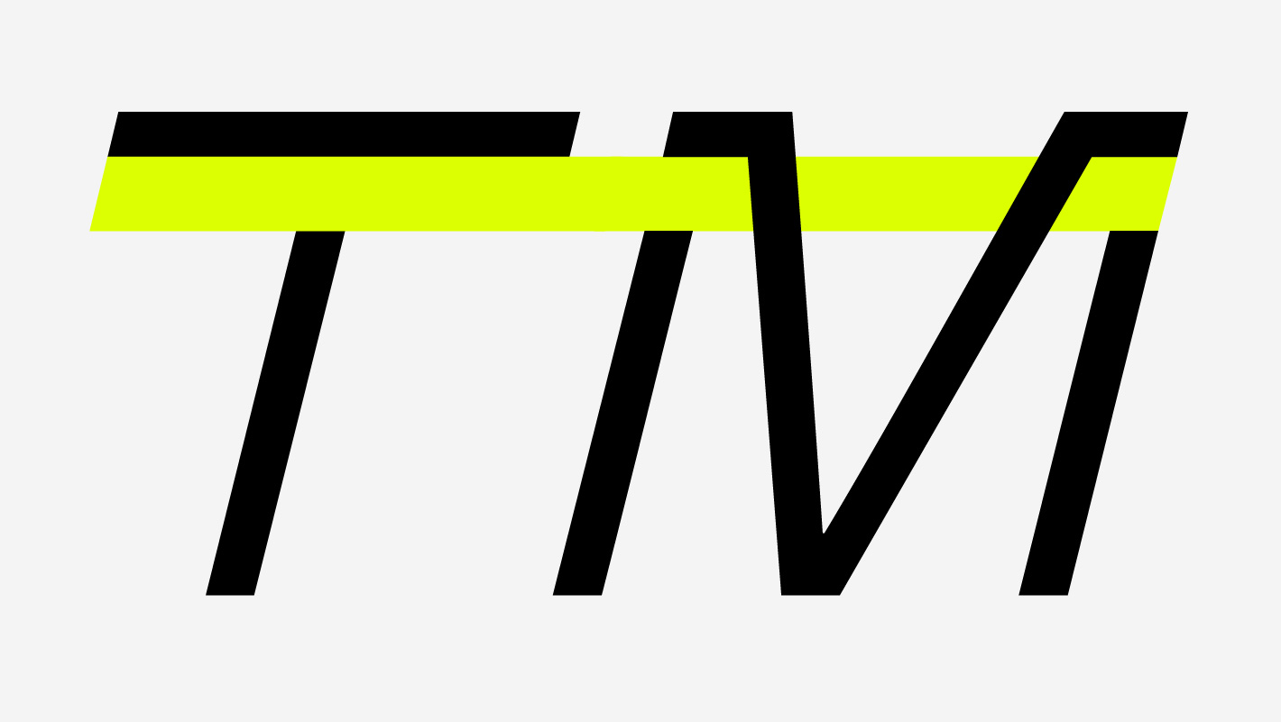
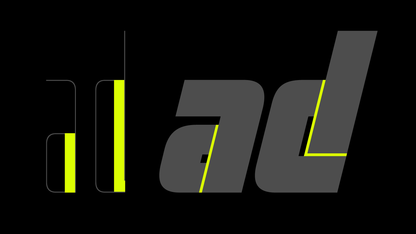
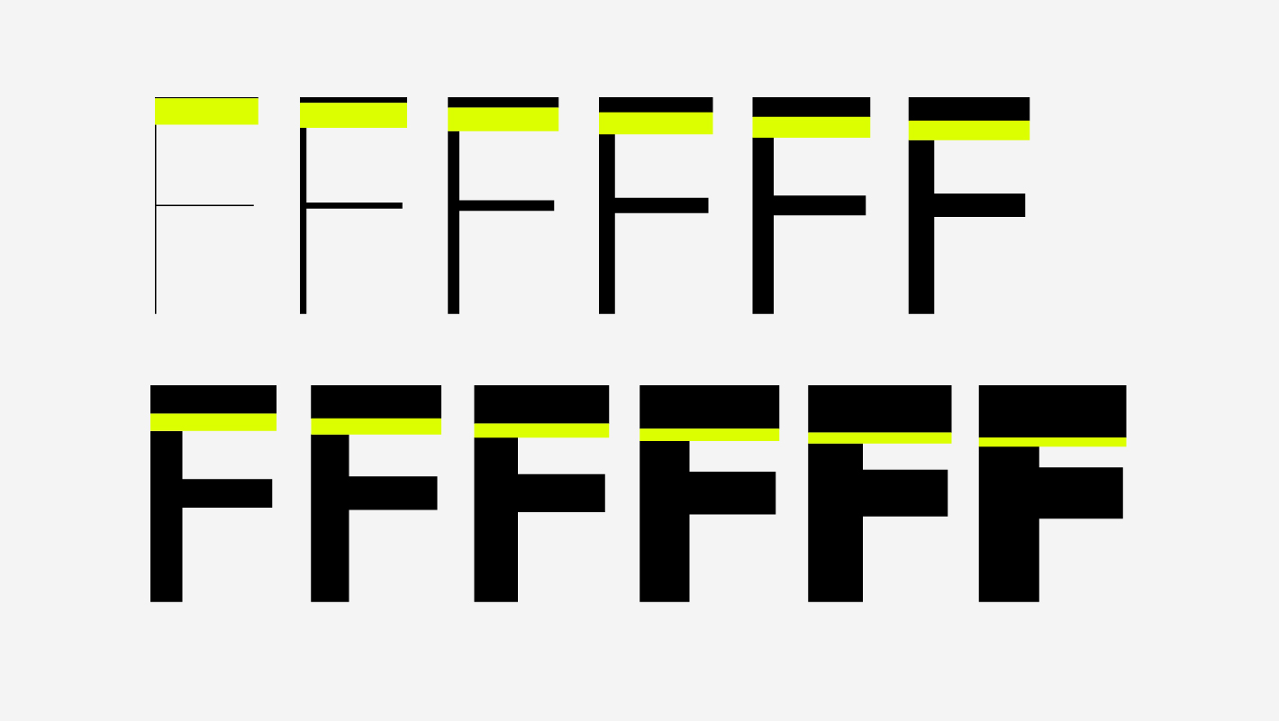
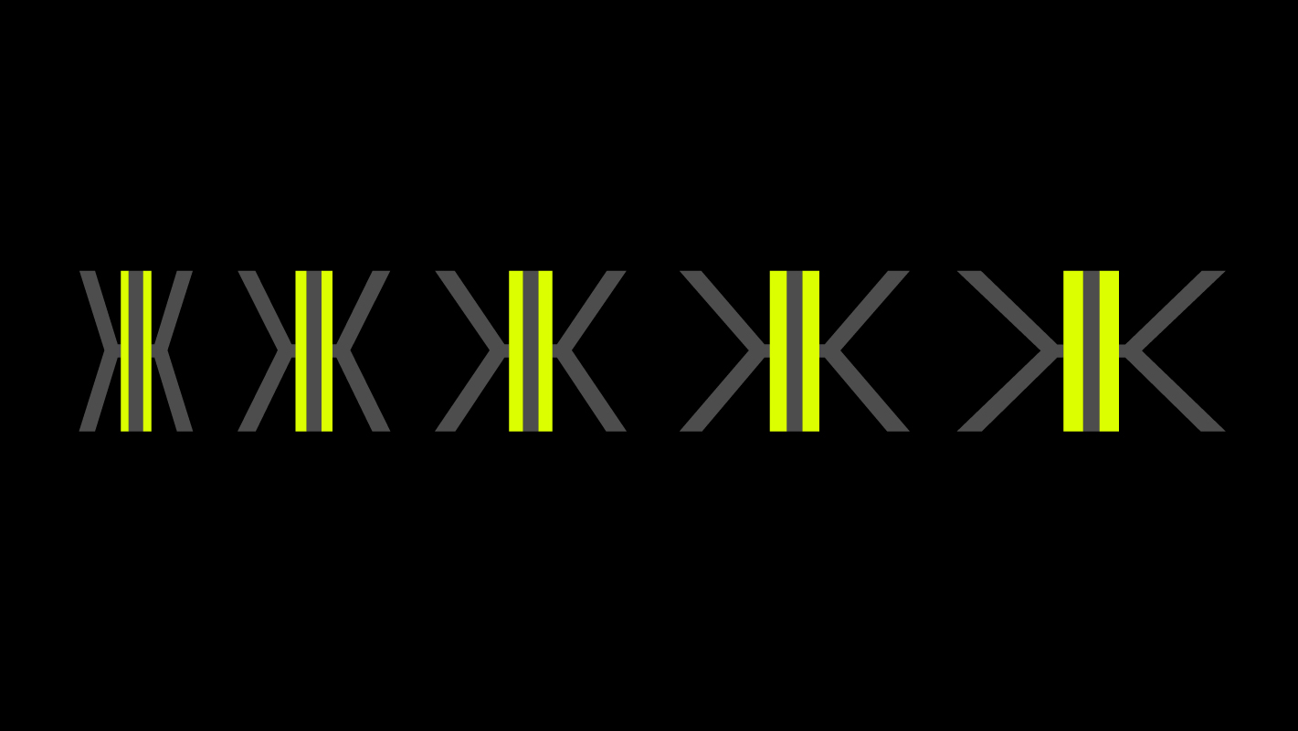
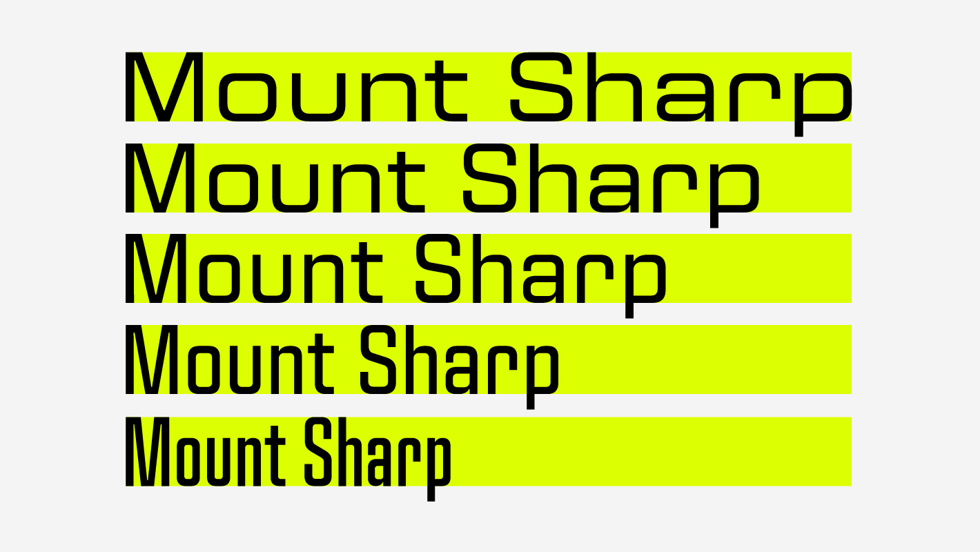
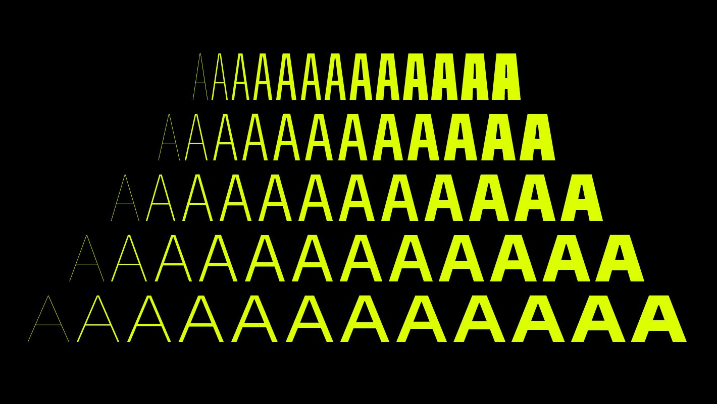
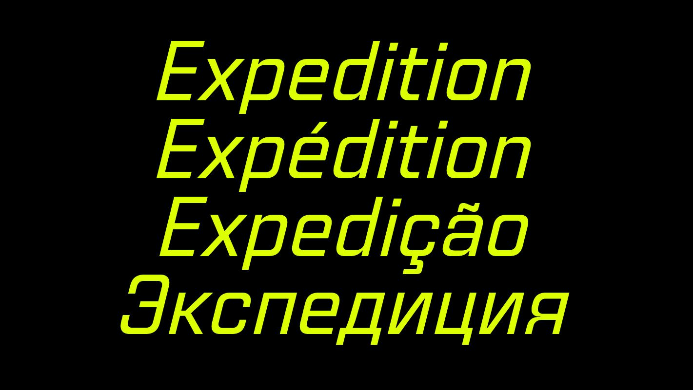
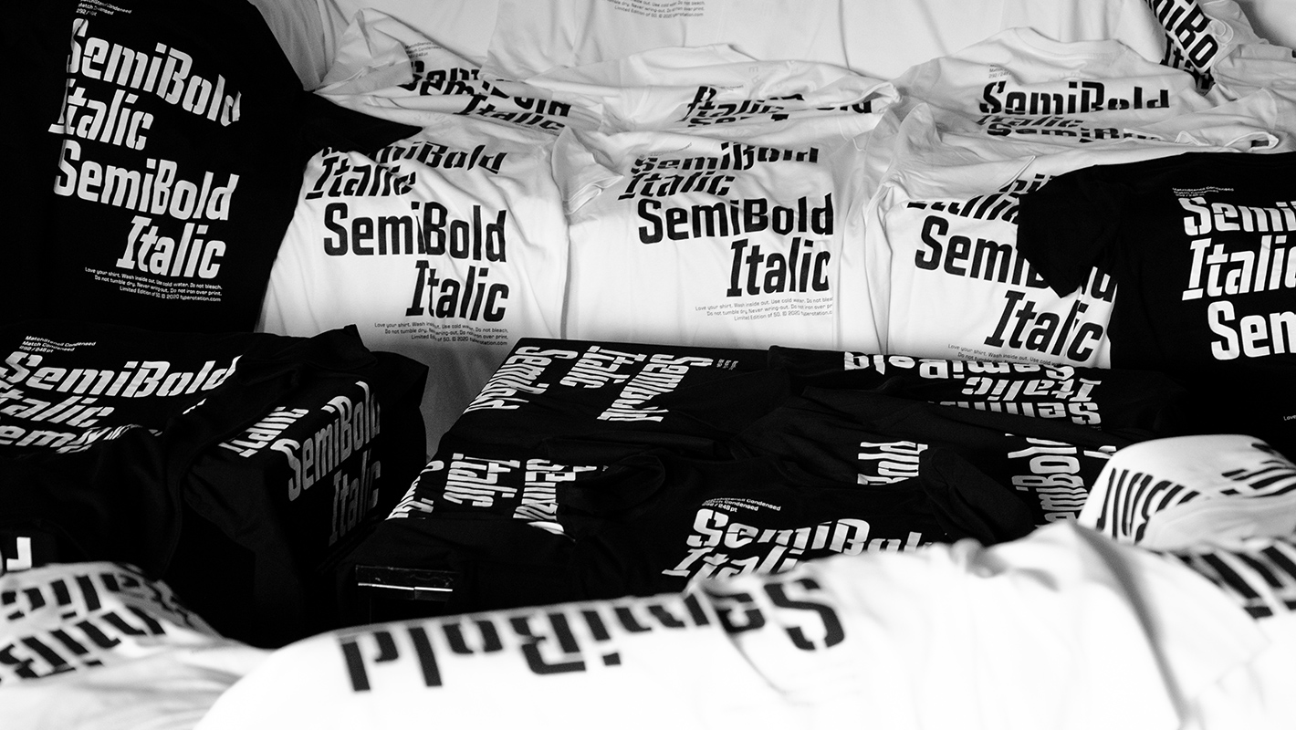
During the process the family was further expanded. As a result the five families Condensed, SmCondensed, Normal, Wide and ExtWide were designed. Each family includes extreme weights from ultra-light Air to super-fat ExtBlack, plus their respective italic versions. The character set is produced for extensive language support (Latin Extended) and a Cyrillic character set has been added. Depending on weight and width, TR Match appears pragmatic and unagitated towards charismatic and stubborn. As a result, the range of applications is wide and the possible combinations — even in cooperation with its stencil counterpart — are inexhaustible. Inspired by science-fiction visuals and user interfaces, the family is strongly positioned in the cinematic titling area and is suitable for corresponding scenic and graphic designs as well as for contemporary UX/UI designs. The TR Match and TR MatchStencil families are an option for designers who want to create contemporary applications. Free of superfluous details, TR Match family quickly creates a text image that is decisive and full of character. The stencil version is a perfect companion — both families complement each other for a wide range of layout tasks. In addition, it is simply fun to play around with Match. The family includes alternative characters, superscript and subscript numbers, tabular figures (note: by default, currency symbols and figures are proportional) and various special characters. More details can be found in the »OpenType Features« section of the Retail Font product pages. TR Match and TR MatchStencil are in use for various Goods to convey distinctive messages. Click here for TR Fonts.